Picture this: you’re finally having your professional photo taken, but when you see the result, something doesn't look quite right. Maybe your skin seems washed out or your clothes are screaming for attention for all the wrong reasons. Here’s the truth not everyone talks about—colour can make or break a photo shoot. Let’s crack the code so you never find yourself regretting your wardrobe choices again.
Direct Answer – What is the Best Colour to Wear for a Photo Shoot?
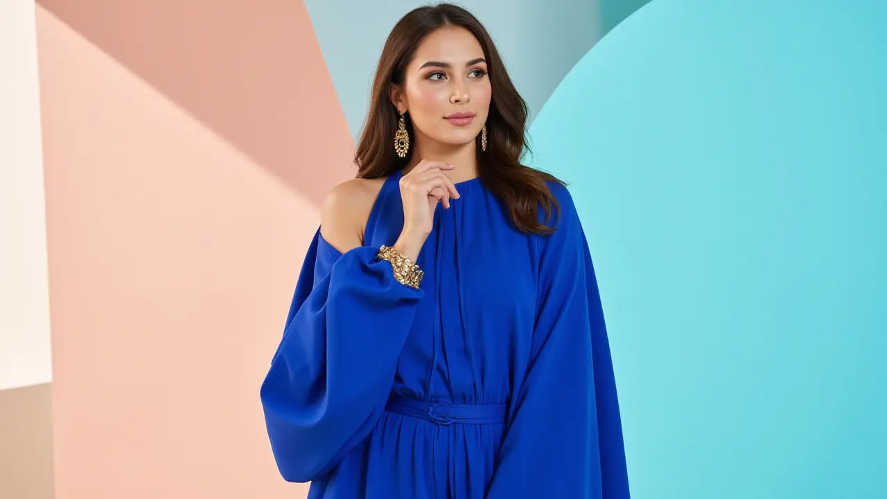
If you want the fast answer, you can’t go wrong with solid, neutral colours for a photo shoot—think navy, grey, beige, white, cream, soft pastels, and earth tones such as burnt orange or olive. These flatter most skin tones and don’t steal the spotlight from your face. Bright reds, pure white (for lighter skin), neon, and super dark hues like pure black can cause issues with lighting or pull attention away from you. But hey, the best shade really does depend on the setting, your complexion, and the vibe you’re aiming for.
If you’re shooting outside in the greenery, try earthy colours or soft pastels. For an urban background, navy or deep jewel tones pop. For studio shoots with lots of white, avoid wearing pure white to prevent looking washed out. And when in doubt? Ask your photographer—they know what works fabulously through the lens.
- Solid, neutral tones keep the focus on you and your expressions
- Earthy hues and pastels suit outdoor settings
- Jewel tones like emerald or sapphire are flattering and add richness indoors
- Pale skin can look washed out in stark white, while darker skin tones glow in bold pastels or deep colours
- Bold patterns or logos are risky and can distract from your face
Key Points – Quick Takeaways for Your Next Photoshoot
- Neutral and solid colours are usually safest for all skin types and settings
- Match your colour to the background for the right kind of contrast
- Keep patterns simple or skip them altogether
- Deep jewel tones or earth tones bring warmth and depth to most photos
- Consider the message and mood you want the images to capture
- Dress comfortably—confidence shows up in every shot
Comprehensive Guide to Wearing the Best Colours for Photo Shoots
There’s a reason the top stylists and photographers get picky around wardrobe choices. It’s not just about looking good—it’s about playing with light, shaping mood, and even giving your skin a healthy glow. Let’s unpack how to nail your look before the first camera click.
When you look at iconic photos, you’ll notice something: the subjects rarely wear ultra-bright neons, giant logos, or wild patterns. That’s no accident. The goal is to keep the picture focused on your face and emotion, not your shirt’s screaming lime green or dizzying prints. Neutral shades like navy, beige, olive, taupe, and muted blues create a classic, polished look. They’re timeless and harmonious, and they balance well with most backdrops. On top of that, softer pastels work wonders for a spring or summer vibe—they reflect light to flatter almost every face.
Colour psychology steps in here too. Warm tones (think terracotta or caramel) give an inviting feel, while cool tones (ice blue or mint) lend freshness or calm. Jewel tones deserve a mention: emerald, sapphire, amethyst… These add depth and sophistication and tend to flatter both lighter and richer skin tones. The reason? They absorb light in a flattering way and rarely “bleed” in photos, so the camera picks them up cleanly.
Big no-nos? Avoid neon and overly shiny or reflective fabrics unless you want to look like a disco ball. Pure black can sap the life out of your complexion, especially in low light. Pure white, meanwhile, can throw off the camera’s exposure—unless your photographer lights you to perfection. Heavily patterned outfits or clothes with massive logos steal the show—and not in the way you want.
Trendy looks fade, but some basics just work forever. That’s why even fashion magazines recommend having a few neutral tops on hand for headshots or modelling tests. A survey of pro UK photographers found 79% preferred solid, muted tones for client portraits. As a Bristol local, I know the city’s parks and historic backdrops pair beautifully with olive, navy, or warm brick hues—nothing too loud that would fight with the beauty around you.
And don’t forget props—if you must use them, keep their colours coordinated too. A chunky, bright scarf or hat will stand out just as much as a loud top. Shoes and jewellery can pop, but should blend with the overall palette.
“The goal of wardrobe for photos is to flatter, not distract. Keep it classic, keep it simple, and you’ll always love the pictures.”
– Rosella Lloyd, British Vogue stylist
Definition and Context – Why Colour Matters in Photo Shoots
Let’s break down why your outfit shade matters so much under the flash of a camera. Colours affect light, mood, and how your features come across—more than you’d think. Cameras see things differently than the human eye. They pick up certain shades and contrasts and exaggerate flaws that might barely register in person. This magic (or curse, depending) explains why your favourite jumper looks amazing in the mirror but not so much on Instagram.
When photographers set up a shot, they battle with lighting, background, and your outfit. A high-contrast “look” pulls the eye to the brightest or boldest thing—if that’s your neon top, goodbye subtlety! Soft, solid palettes let your face tell the story. That’s especially true for group shots, where matching or coordinated neutrals stop anyone from standing out for the “wrong” reasons.
Colour also triggers emotions. Blues and greens are calming, reds and oranges feel bold and energising. When you’re picking your photo shoot wardrobe, it pays to consider the feeling you want to give off. As a fun example, in social media and dating profile pictures, people who wear blue or green are often rated as more trustworthy and approachable. Meanwhile, constant red or black might read as intimidating or overly formal, depending on context.
Here’s the thing: there’s actual science at play. Pantone’s annual colour trends come from masses of design and psychology research. Wedding photographers know this inside out—those gentle blushes, dusty blues, or sage greens aren’t just pretty, they’re easy on skin tones and suit lush backgrounds, too. In Bristol, with its mix of urban and parkland scenery, subtle or earth-inspired shades just meld with the surroundings better than harsh brights or black-and-white combos.
This isn’t only about natural light, either. Even in a studio, the flash can bounce harshly off shiny or very light items, causing strange reflections or hot spots in the picture. The clever use of colour can cut this problem off at the pass. Want proof? A quick look at top celebrity portraits—solid, fitted, muted clothes rule the day nearly every time.
If you’ve got a professional event or family session coming up, colour planning is one trick that will never go out of style.
Benefits of Choosing the Right Colour for Your Shoot
It’s not just about looking good—it’s about making the entire process smoother, ooze confidence, and produce versatile shots you’ll actually want to frame. Here’s what picking the right colour can do for you.
- Your skin tone pops and looks radiant, thanks to careful contrast
- Your features—eyes, smile, hair—stand out, not the fabric on your chest
- You look polished, pulled together, and timeless (avoid that date-stamped “so 2022” cringe in five years)
- Photos are easier to edit and retouch with neutral or consistent palettes
- You won’t have to worry about parts of your outfit “blending into” or “clashing with” the background
- Matching the setting (urban, green park, seaside, home interior) makes the whole scene look harmonious
- Photographers can focus on posing and lighting, not fighting your shirt’s reflection
I remember a shoot last year in Clifton (right by the Suspension Bridge, if you know Bristol) where a client wore a deep forest green jumper against autumn leaves. It was magic. Her freckles, auburn hair, and smile glowed in the golden hour sun, and the wardrobe choice made editing a breeze. On the flip side, I once saw a poor bloke turn up in a shiny, electric blue suit to a studio headshot. Every image needed hours of retouching to tame the glare—and his face, not his outfit, should have been the hero.
It sounds simple, but wearing the right colour for a photo shoot really is the ultimate “life hack” that leaves a great impression on everyone who sees your photo—friends, family, employers, clients.
Here’s a table comparing colour choices and their typical impacts in photoshoots, based on guidance from pro portrait studios in the UK:
| Colour | Effect in Photos | Best Setting |
|---|---|---|
| Navy/Blue | Calming, flattering, slimming | Studio, nature, urban |
| Beige/Taupe | Timeless, warm, suits all | Outdoors, family, business |
| White | Fresh, risky for light skin | Group shots, urban |
| Black | Classic, can look harsh | Business, studio |
| Pastels | Gentle, romantic, soft | Spring/summer, weddings |
| Jewel Tones | Vivid, rich, elegant | Indoor, studio, evening |
| Neon/Bright | Loud, distracting, reflective | Avoid for portraits |
Pretty handy, right?
Tips to Pick the Perfect Colour for Different Photo Shoot Types
Okay, so you know neutral and solid colours are a safe bet, but what if you want something a little spicier, or you have a special type of shoot coming up? Your outfit can absolutely reflect your character or story—you just want to do it with intention.
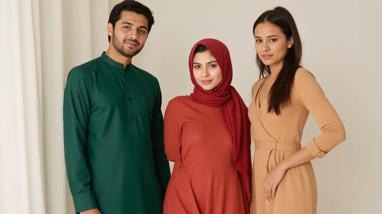
- Family Photos: Coordinate, don’t match. Soft, earthy colours that complement each other look ten times better than rows of identical white tops. Avoid too many clashing patterns.
- Professional Headshots: Stick to one strong, solid shade, ideally from the “business” family—navy, burgundy, grey, olive. These colours radiate professionalism on LinkedIn but still show personality.
- Outdoor Portraits: Let nature guide you. Go for tones you’d find outside: moss green, stone grey, muted mustard, rust. If you’re shooting in the city’s graffiti zones, consider a single bold statement colour in a fitted style—just not neon.
- Studio Shoots: With formal backdrops or white/grey backgrounds, richer colours like forest green, deep plum, or sapphire add depth. Stay clear of pure white or black unless your photographer guides you.
- Fashion Shoots: This is your chance to experiment, but always test how a fabric looks on camera first. Avoid anything that’s super shiny or super stiff.
Don’t ignore hair and makeup, either—bright tops can highlight redness in your face, while pale tones might make dark circles pop. If you’re unsure, drape different tops on your shoulders in natural light and snap a few selfies. You’ll spot straight away what makes your eyes shine and what drains you out.
“A strong, thoughtful colour choice can be the difference between ‘just another photo’ and one you actually want to hang on your wall.”
Go ahead, try bold accessories if your clothes are simple—think a statement necklace with a plain top. It adds character without overwhelming the shot.
FAQ: Your Questions About Photo Shoot Colours Answered
Q: Are certain colours better for every skin type?
A: In general, cool skin undertones look good in cool colours (blue, emerald, lavender), while warm undertones glow in earthy hues or rich reds. That said, mid-tone neutrals suit nearly everyone. If your veins look blue/purple, you’re likely cool; if green, you’re probably warm.
Q: Should couples or groups match outfits exactly?
A: No need to match like twins—coordinated palettes using shades from the same family work better. Think a range of greys, blues, and whites, or soft earth colours with a single accent shade. The result looks more natural but still unified.
Q: What about black or white for headshots?
A: Black is slimming and can be striking, but it swallows up light and details. Pure white can make lighter skin look pale, and pose exposure problems if not lit perfectly. Try off-white, cream, charcoal, or navy as safer alternatives.
Q: Is it risky to wear red?
A: Red can bleed on digital cameras and becomes super bossy if it’s the brightest colour in the photo. Deep berries or muted maroons are safer if you want to stand out without overpowering your photos.
Q: Can I use big accessories or props?
A: Absolutely—if your clothes are neutral and simple. Think one chunky necklace, a fun scarf, or a stylish bag in a statement shade. Too many bold pieces, though, and you’ll vanish behind the props.
Ready to glow in your next shoot? Lay out those outfits, snap some test shots, and get input from a friend if you’re on the fence. A little planning goes a long way towards a perfect portrait—trust me, your future self will thank you.