Flattering Colours for Photography – Choose the Right Hues for Stunning Shots
If a picture looks dull, the colour choice is probably the culprit. Picking the right shades can instantly lift a portrait, a product shot, or a landscape. Below you’ll find simple rules that work for any camera, any lighting, and any skill level.
Warm vs Cool – When to Use Each
Warm colours (red, orange, yellow) add energy and draw the eye. Use them when you want a subject to feel lively – think fashion editorials, food photography, or sunrise scenes. Cool colours (blue, green, purple) calm the mood and often flatter skin tones, especially in indoor portrait work. If you’re shooting under fluorescent light, a cool background can balance the greenish cast. Remember: you don’t have to stick to pure hues. A warm orange dress looks softer against a muted teal wall than against a bright red backdrop.
Practical Colour Pairings for Different Shoots
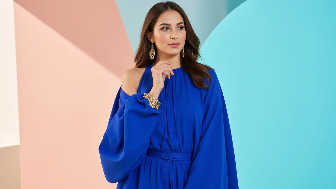
Portraits: Aim for a subtle contrast. A navy jacket on a light‑skinned model works better than a bright orange shirt. For darker skin tones, jewel tones like emerald or ruby bring out depth without overwhelming.
Product shots: Keep the background neutral (white, light gray) and let the product’s colour pop. If the product is a bright blue gadget, add a hint of orange in props – the opposite side of the colour wheel creates a punchy look.
Outdoor scenery: Early morning light naturally pushes colours toward cool blues. Dress your subject in warm earth tones (rust, mustard) to create a pleasant contrast. During golden hour, warm shades blend with the light, so you can safely use cooler blues for a balanced feel.
Another quick tip: use the “90‑10 rule”. Let 90% of the image be neutral or soft tones, and reserve 10% for a bold accent colour. This keeps the picture from looking chaotic while still giving it a focal point.
Lighting plays a big role, too. If you’re using a white flash, it won’t shift colours much. A colored gel over the light can add a creative splash – a subtle pink gel can soften skin, while a blue gel can give a moody vibe.
Finally, always test on your camera. What looks good on a screen might shift when the sensor processes it. Take a quick shot, review the histogram, and adjust the white balance if the colours look off.
By watching the colour relationship between subject, background, and light, you’ll start to see why some photos just click. Keep these guidelines handy, experiment with a few outfits or props, and you’ll notice the difference right away.
Best Colours to Wear for a Photo Shoot: Expert Tips for Flawless Photos
Discover which colours make you look best in photos, why they work, and how to pick your next outfit for a photoshoot. The guide unpacks the science and psychology behind colour choices.